How to Introduce Pantone's 2022 Color of the Year "Very Peri" into Your Home?
Pantone had recently released their Color of the Year for 2022, and it is unlike anything we've seen before. It is because 'Very Peri,' a warm, bold lavender tone, is a fresh and brand new shade invented from scratch by Pantone.
Pantone describes it as, "a dynamic periwinkle blue hue with a vivifying violet-red undertone that blends the faithfulness and constancy of blue with the energy and excitement of red’ – it’s a color promising to bring joy as the ‘happiest and warmest of all the blue hues."
Very interesting, right?! Carefree, daring, confident curiosity —this is the theme of this color nouveau. Very Peri has a lot of potential! You should not be hesitant to play around with this bold, vibrant hue.
As we emerge from a trying season on a global scale, it inspires us to dare and try something unprecedented. It is time to bring this richness into your interior space! So, the real question now is: how do we incorporate purple into our homes?
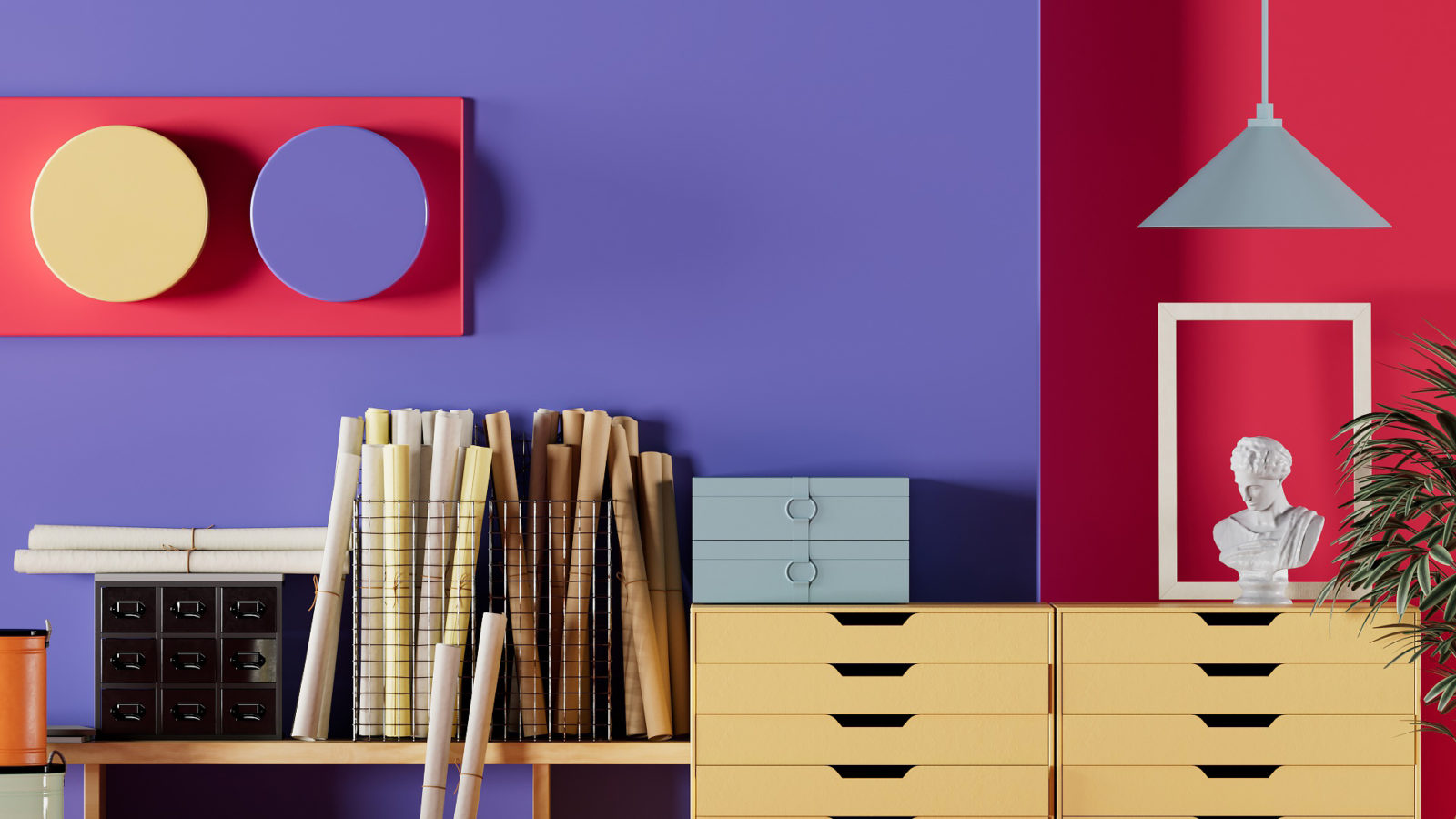
1- Find the right palette and match
You can introduce Very Peri into your home's color palette with some creative color schemes. This one-of-a-kind hue pairs beautifully with green, pink, white, and beige. It also offers great value when matched with yellow and orange tones.
Because orange and yellow are complimentary and they sit opposite one another on the color wheel, each of these colors will appear more vivid when paired with Very Peri. This color combination makes a bold statement in your space and can be achieved with Very Peri wall paint and yellow and orange decorative items.
Being a versatile shade, Very Peri brings a sense of tranquility and comfort, and is therefore highly recommended for spaces like the bedroom, living room, bathroom, or study. For interesting visual tips on various color palettes, check out the slides at: 5 Decor tips for a "Very Peri" home.
2- Introduce a statement item
Very Peri adds a pop of color and can accentuate the living room with a statement piece of furniture. You can even include this vibrant color into your bed's headboard. Use Very Peri in the form of bold patterns or as a solid color in upholstery materials like linen, cotton, velvet, jacquard, and faux leather.
If you feel Very Peri will look too bold in large doses, then use it in more subtle ways, such as in the bed linen, curtains, cushions, bed sheets, rugs, or throws. This way of introducing the Pantone color of the year is less permanent. Add a splash of energy to your dining table setting with Very Peri table mats, paper napkins, or table cloth. Bring this Very Peri touch into your bathroom in the form of hand towels, decorative soap dispensers, tissue boxes, and a shower curtain.
3- Feature an accent wall
Break free from neutral-toned walls and paint them instead in accent color. Introduce Very Peri to the accent walls of your living room or bedroom to add flair and a new vibe to your home. In color theory, cool colors are calming and a dash of this hue keeps the space from looking dull and sterile. To enhance depth, you can use wallpaper, wall paint or textured paint.
4- Use wall tiles
Very Peri is a great color option for highlighter tiles in the bathroom or on the kitchen backsplash. There are many different shapes, patterns, sizes, and designs of floor and wall tiles available on the market.
5- Accessorize!
If you don't want to commit to this vivid hue, infuse a pop of color to the room by using it for objects and accessories. Use artwork and other decorative accessories to reflect this latest trend in your space. This is an excellent way to update the look and feel of your home.
To add vibrancy to your interiors, bring in vases that are close to this shade of purple and fill them with fresh flowers or plants. You can decorate your bedroom with light fixtures, scented candles, and wall art in Very Peri hues.
6- Introduce as a unisex hue for children's room
To infuse a feeling of playfulness to your teens' bedrooms, consider adding this fun color to the laminates of the cabinetry. Keep in mind that Very Peri is a unisex color that works perfectly in decorating both boys' and girls' bedrooms. To make this vibrant shade less overwhelming, you can pair it with neutral tones. Moreover, if you are expecting but don't want to know the sex of your baby, this Pantone Color of the Year is a sure-fire approach to decorate the baby's new nursery.
For more ideas, please watch this short video: Very Peri Pantone's Color of the Year 2022 + Purple Rooms - Interior Design Tips.
You can also take a peek at how this innovative color is infused into various spaces –both residential and commercial: The 2022 Pantone Color Very Peri In Interior Design.
*** * ***
Purple has long been associated with great wealth and royalty, dating back to the ancient world when it was revered for its intense hues. Purple was an imperial color that citizens were forbidden to wear during the Roman times. And, kings and queens would integrate it into their wardrobe or uniform. Now is the opportune time to bring this bold, brand new color into our homes!
Leatrice Eiseman, Executive Director of Pantone Color Institute, says, “Encompassing the qualities of the blues, yet at the same time possessing a violet-red undertone, PANTONE 17-3938 Very Peri displays a spritely, joyous attitude and dynamic presence that encourages courageous creativity and imaginative expression.”
Are you curious and excited to embrace this fresh, bold color in your interior spaces? Jarvis Interiors offers professional help that will make this Very Peri possible!
----------------------------------
Content Credits
How To Use ‘Very Peri’, Pantone’s Color Of The Year For 2022
Do not be afraid of ‘Very Peri’, Pantone’s colour of the year for 2022